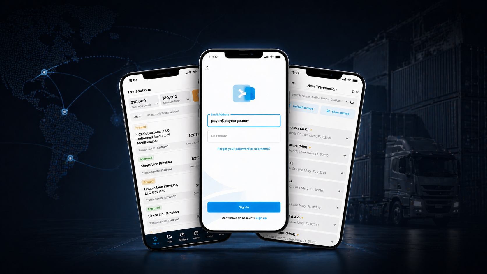
PayCargo's web product served the AP manager at her desk. But freight doesn't run from a desk, and a whole group of users (truckers, drivers, field operators) never sat at one. Until the carrier gets paid, cargo sits at port racking up demurrage by the hour.
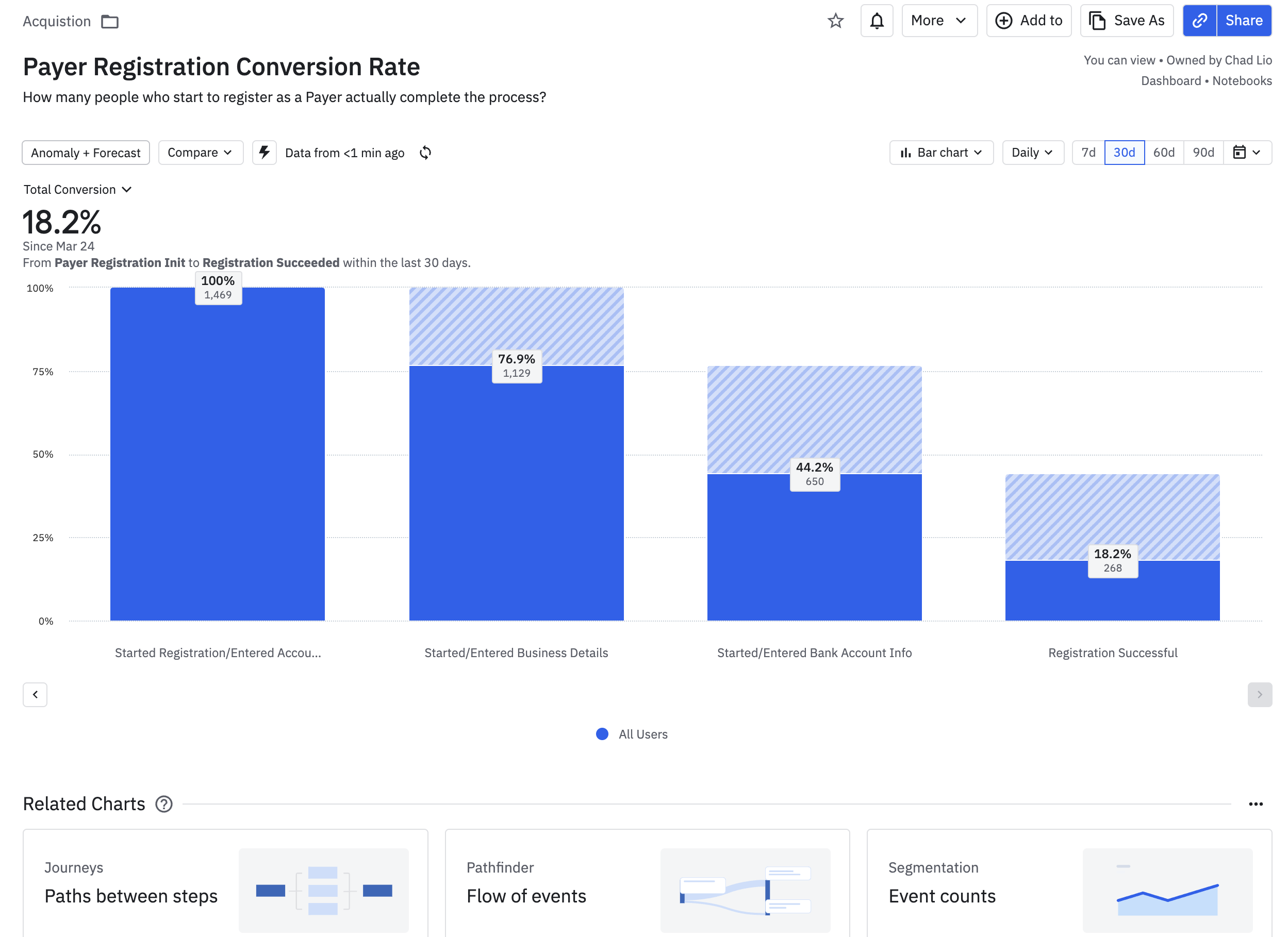
Three signals made the mobile case undeniable: 47% of web sessions started on mobile (and abandoned within two screens), an entire user segment couldn't use PayCargo without a laptop, and 18% of weekly support tickets contained phrases like "on the road," "at the terminal," or "couldn't get to my computer." The opportunity wasn't "PayCargo, but smaller." It was building the tool for the person standing next to the cargo.
Research
Three angles on the same problem.
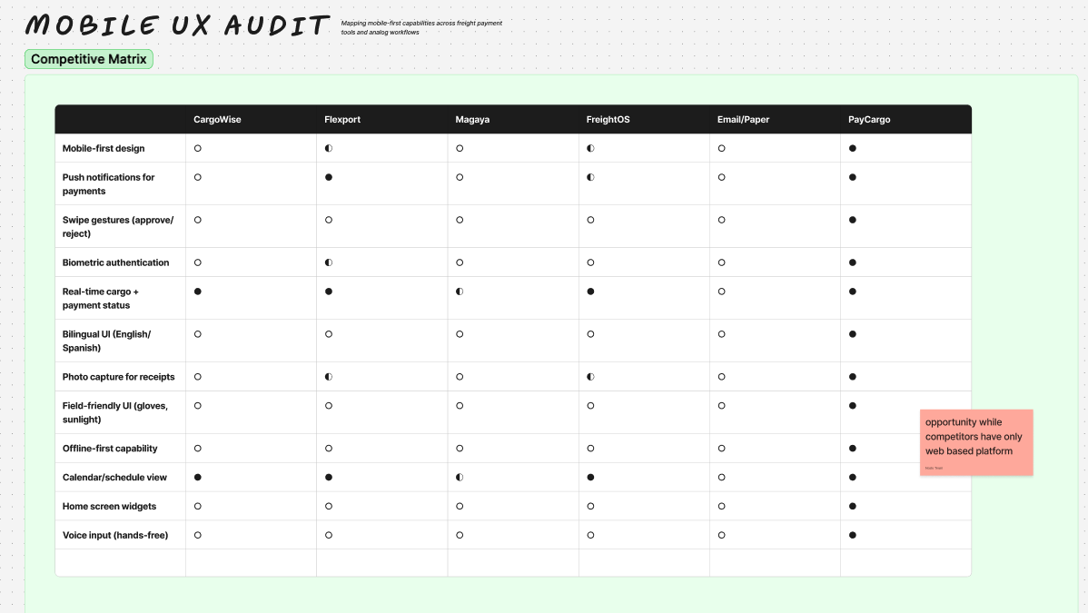
With no existing mobile product to evaluate, I ran three research tracks in parallel: competitor analysis (how the job is solved on competing apps), in-house analytics on PayCargo's mobile-web traffic, and contextual interviews with AP teams, drivers, and field operators in their actual environments. Nothing made the roadmap unless all three pointed at the same friction.
The findings
Mobile opportunities.
Three patterns showed up across the audit, the analytics, and the interviews. The triangulation separated real opportunities from a feature wishlist.
01
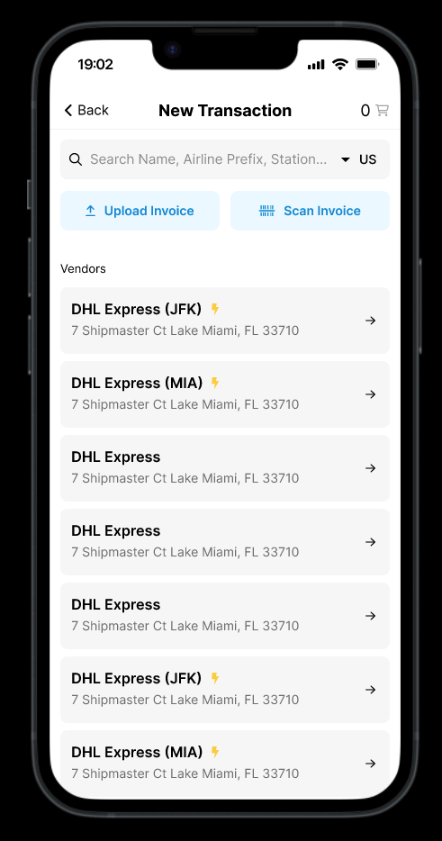
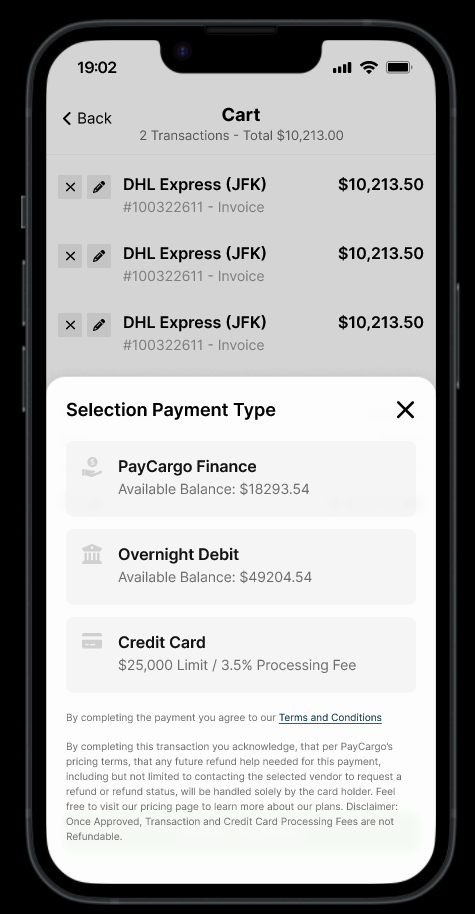
On-site payments at cargo release
Desktop structurally couldn't serve this one:
- Container ready, no AP available. A trucker, driver, or broker is at the gate with the container ready, and payment has to clear now.
- Manual workaround chain. Phone the office, wait for AP to log in, sometimes fax. Every step is minutes lost.
- Cost compounds by the minute. Demurrage starts the moment the wait does. Every minute is paid by the carrier or the shipper, and none of it comes back.
02
Speed-up for AP users on the move
AP teams were already trying mobile and bouncing, because we were forcing them back to desktop:
- 47% mobile sessions, mostly abandoned. People on phones leaking out of the funnel within the first two screens.
- Improvised workarounds. Forwarding emails to spouses, calling junior staff to log in, screenshotting requests over WhatsApp.
- A native flow reclaims the time. The mobile funnel turns the workaround into a 30-second approval.
03
Status at a glance
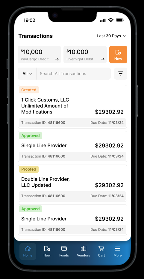
Status checks happen all day, and on desktop they're slow enough that people stop doing them. Mobile turns the check into a one-tap glance:
- Checked many times a day. Brokers, dispatchers, and ops staff constantly watch cargo and payment status.
- No need to open the app. Push notifications, lock-screen status, and a home-screen widget surface what users need without a single tap.
- The everyday-use hook. Quick daily checks build the habit that keeps the app on the home screen.
We also surfaced demand for document capture, receipt scanning, and multi-account switching, but those got deferred to v2 to keep MVP scope tight.