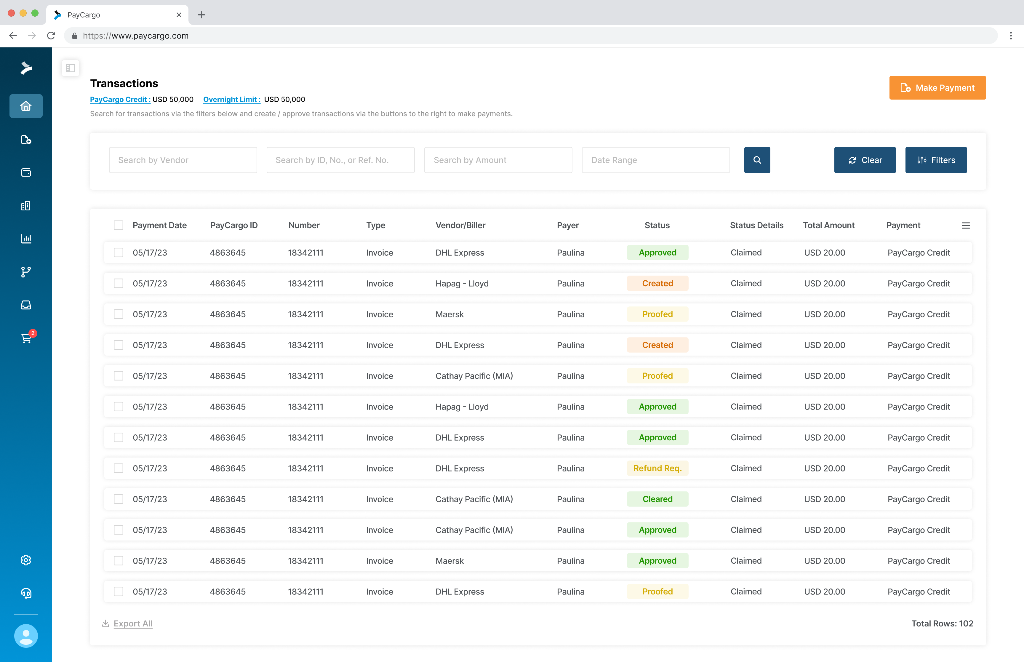
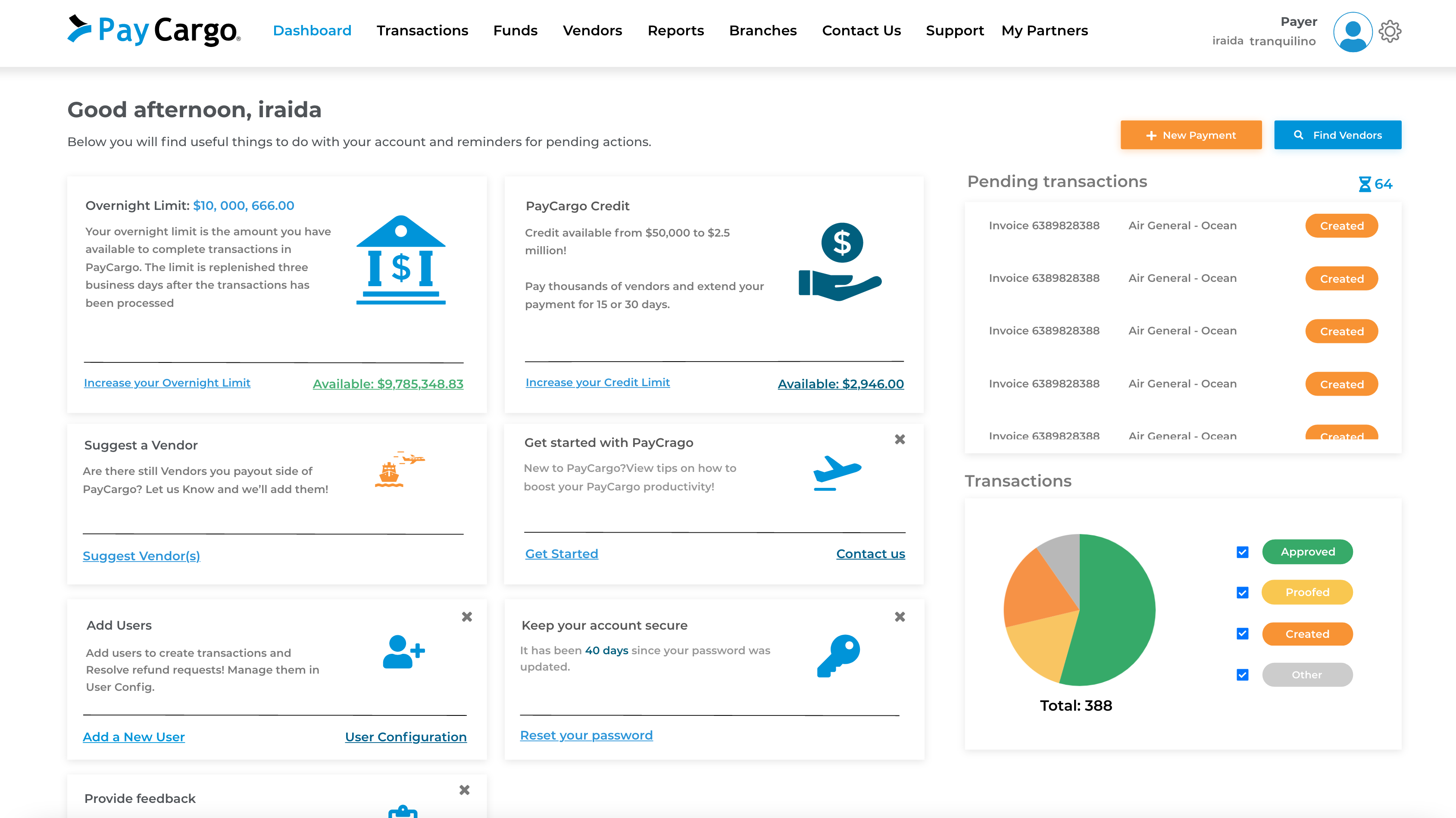
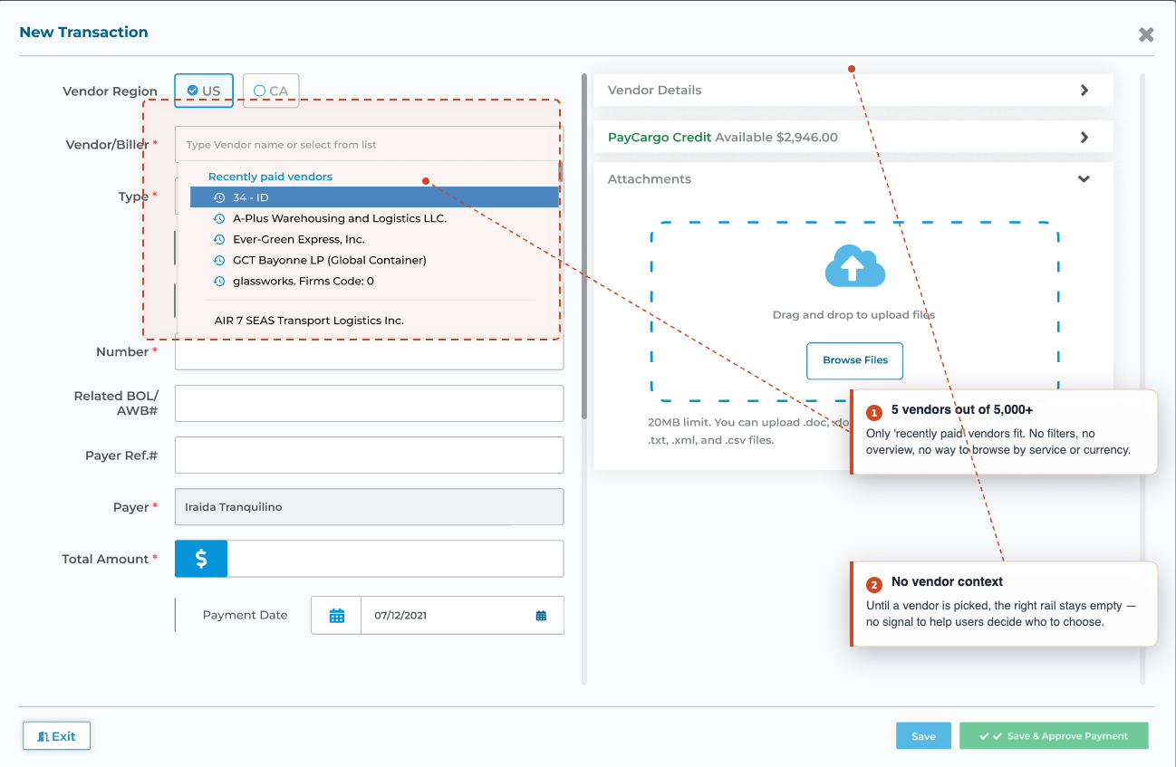
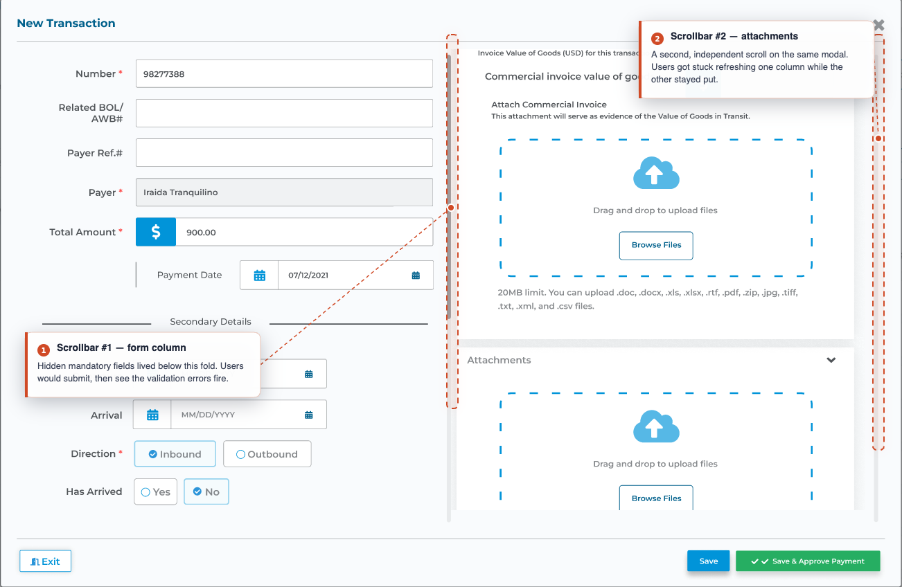
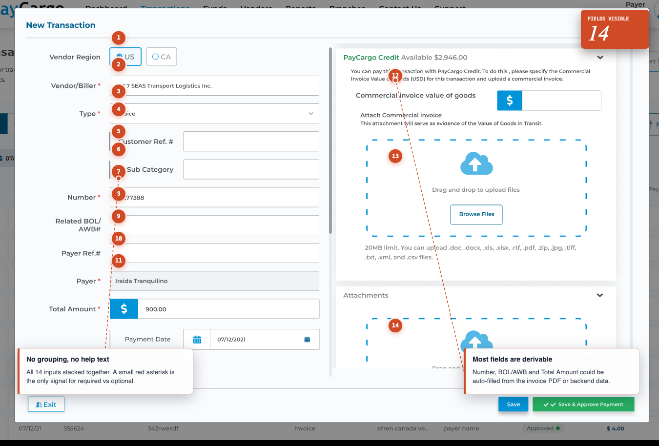
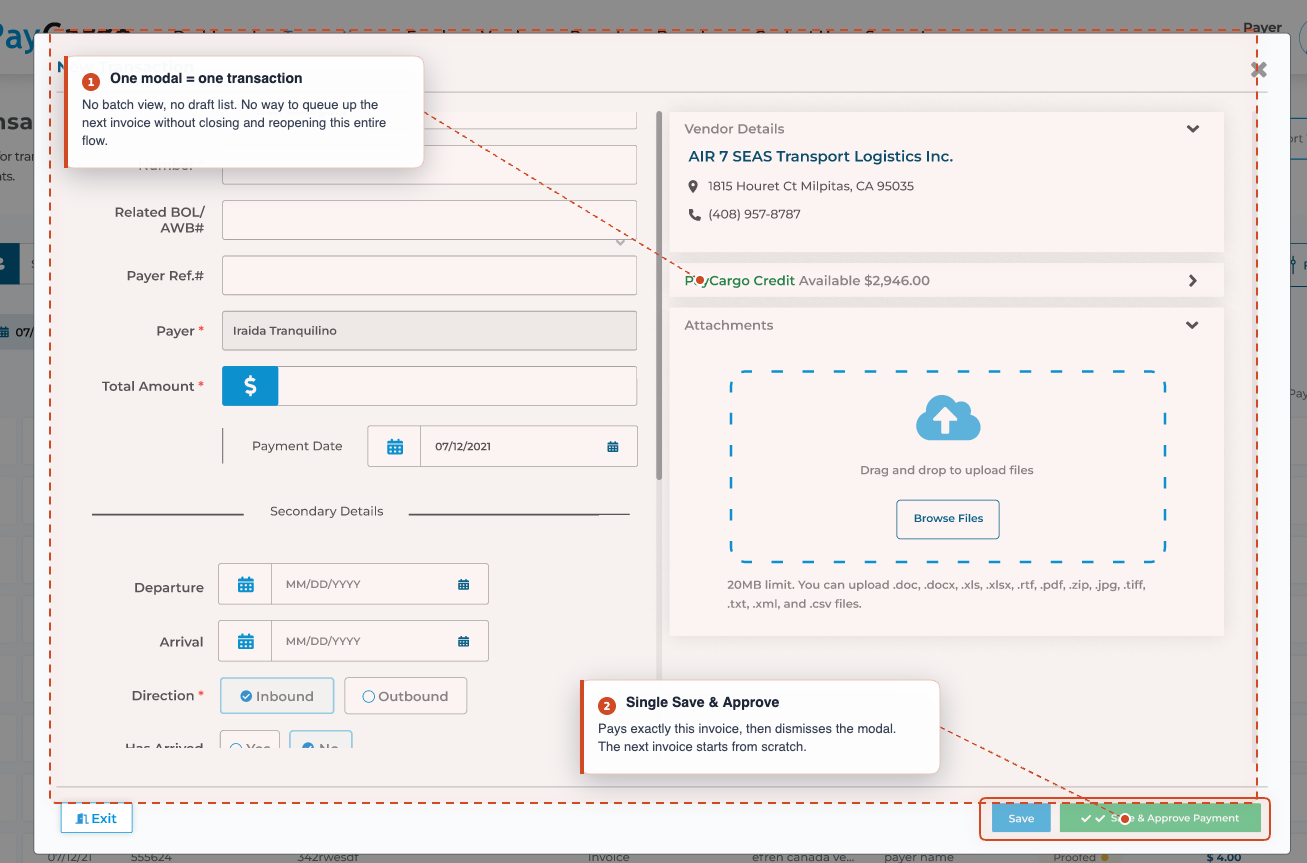
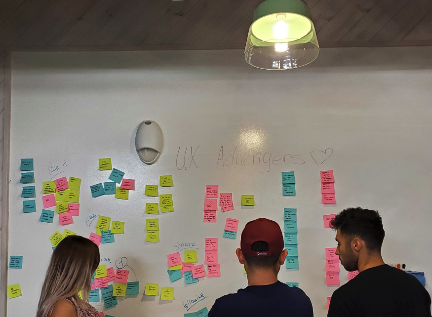
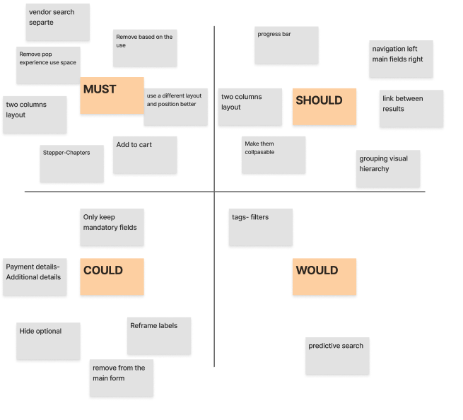
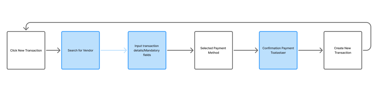
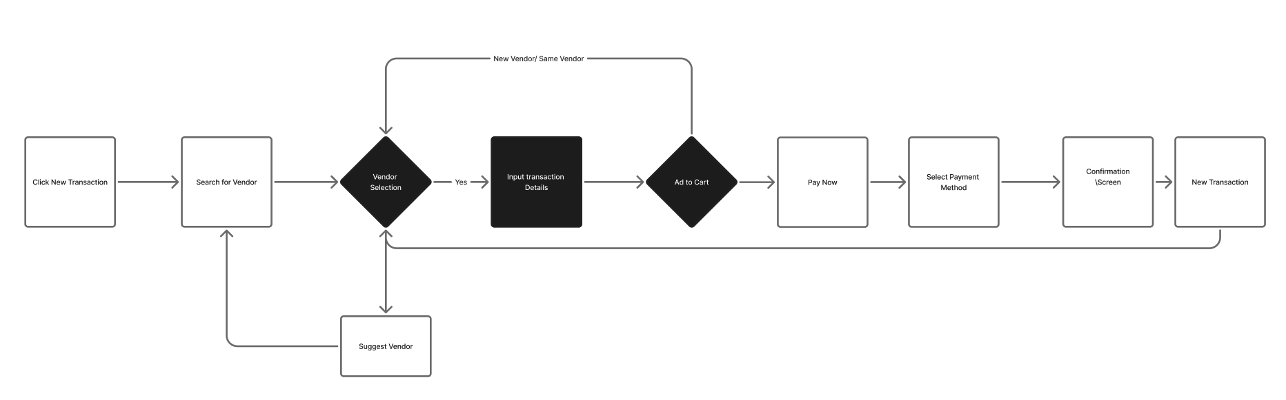
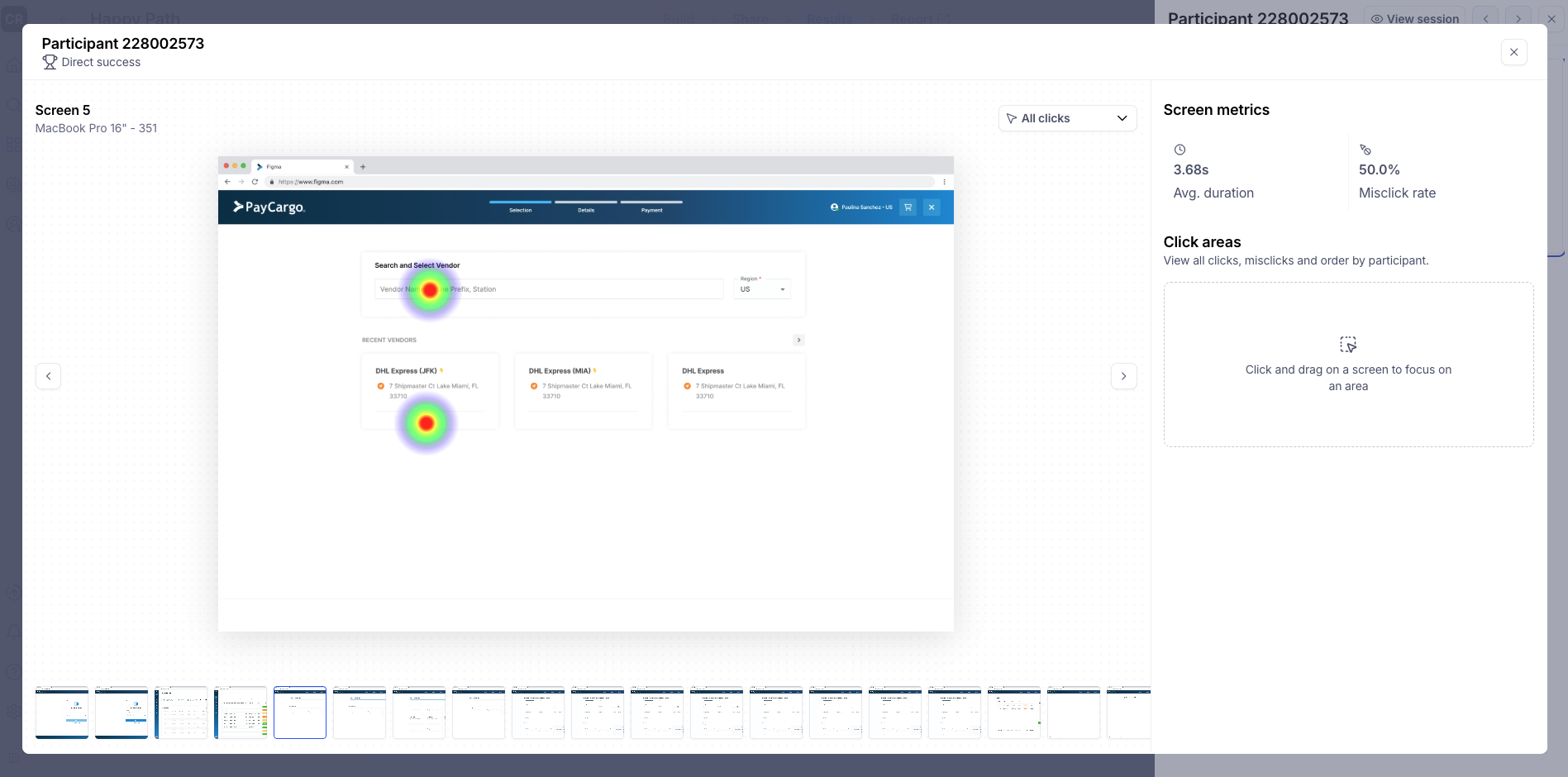
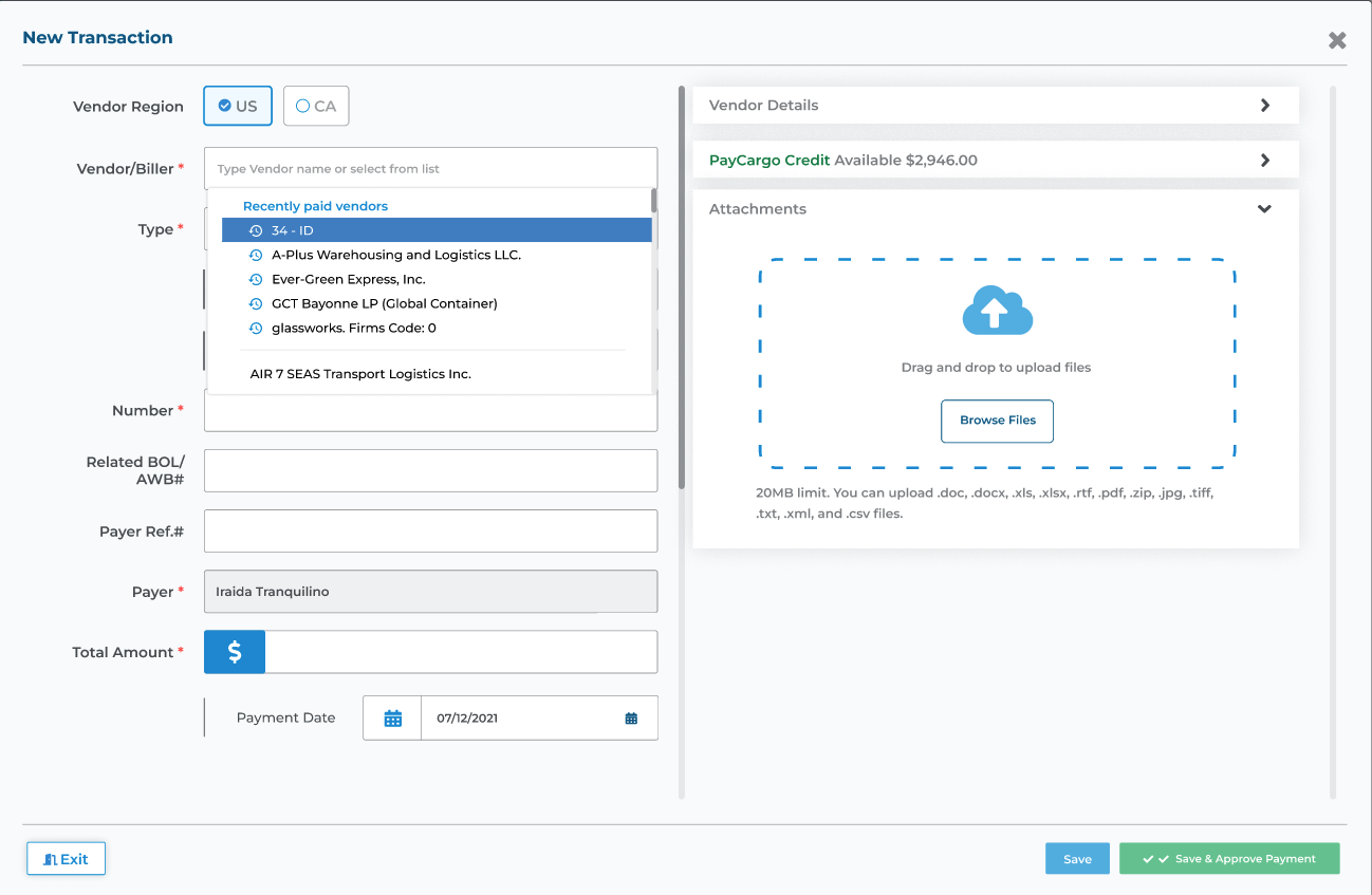
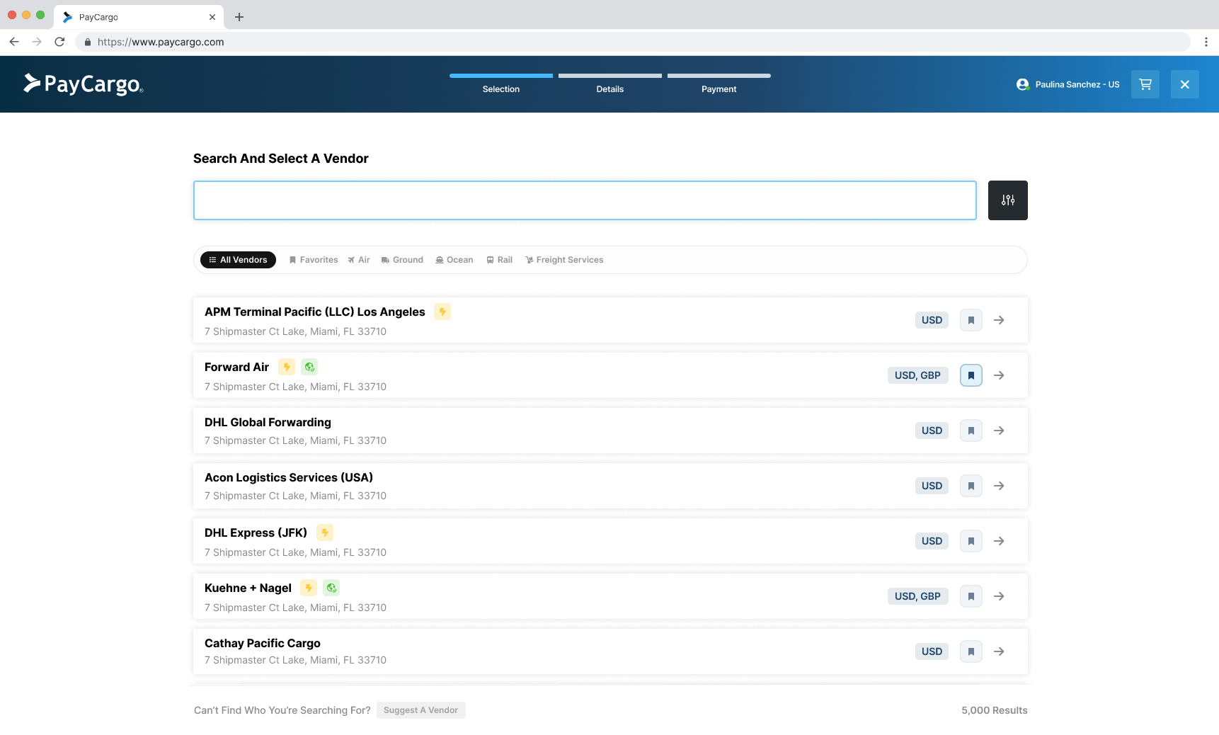
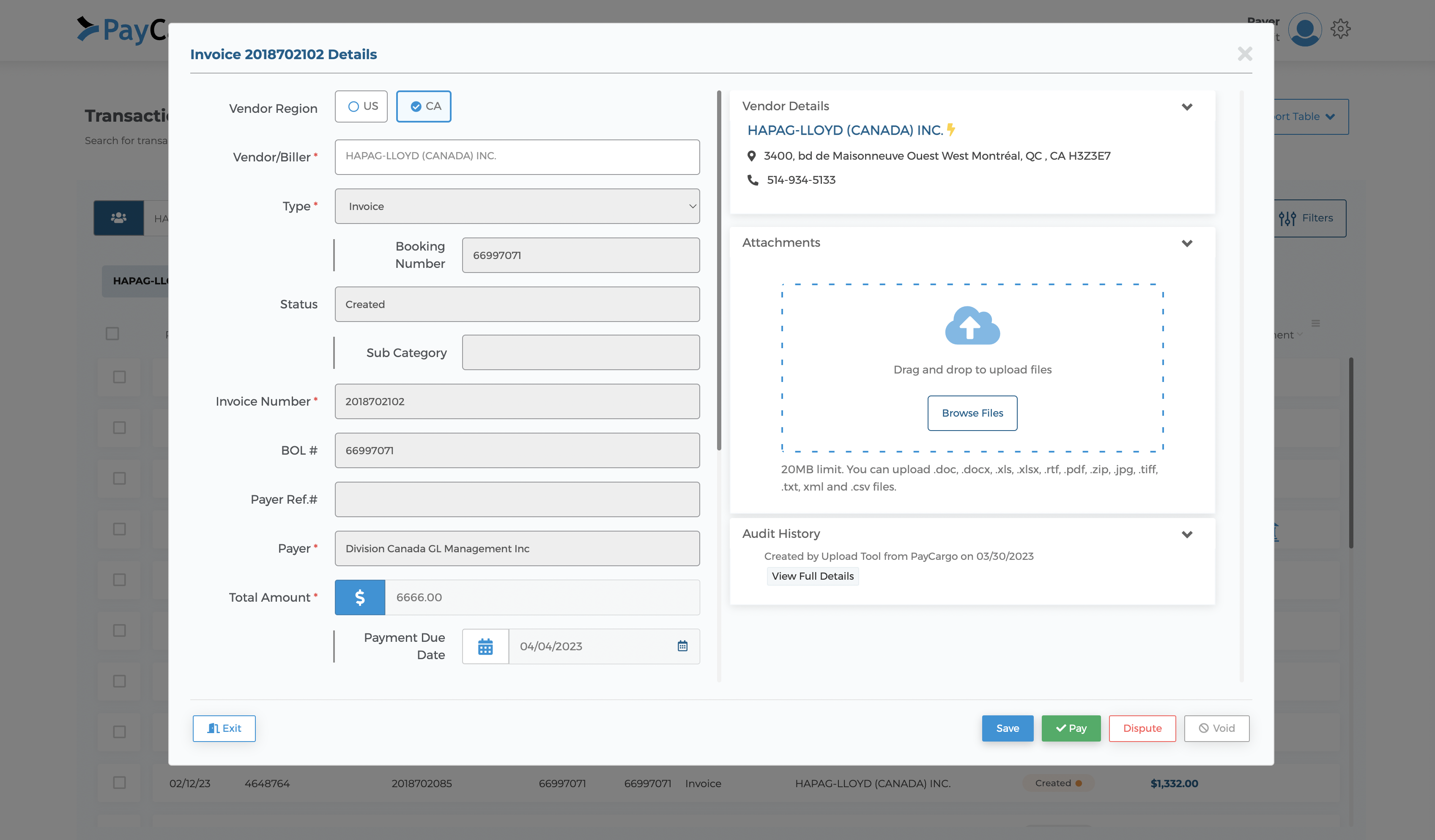
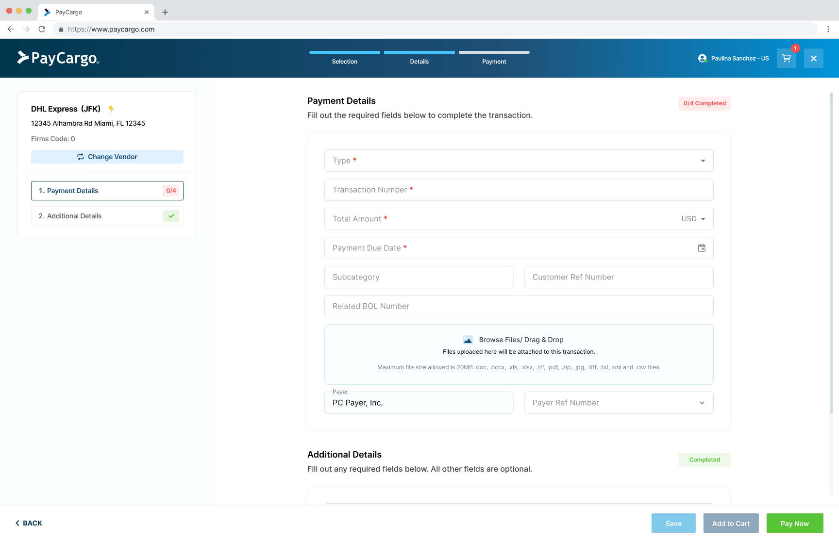
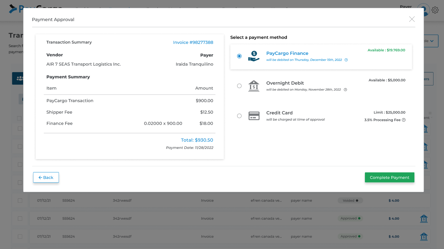
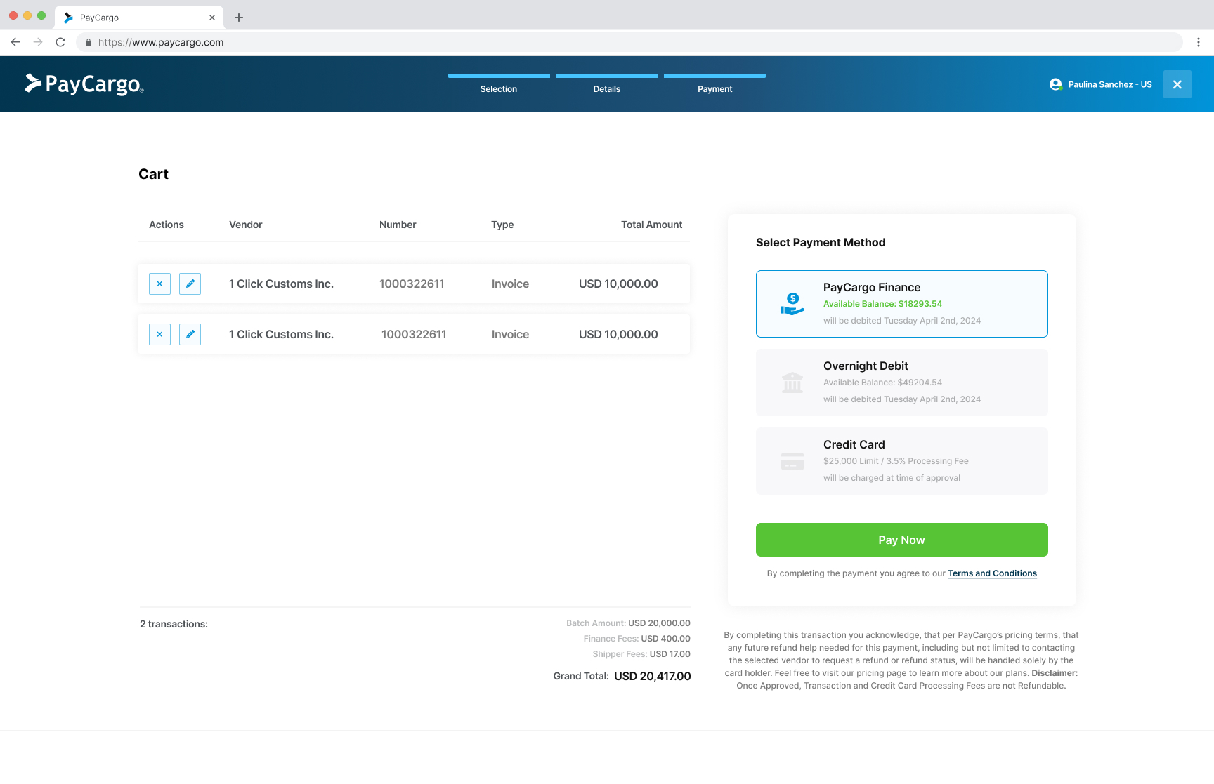
Rebuilding the payment rails of global freight.
I led the end-to-end redesign of how freight forwarders discover vendors, settle payments, and confirm transactions on PayCargo. Higher conversion, faster activation, fewer payment tickets. All on a flow used daily across global logistics teams.
What it meant for the business.
Why we rebuilt the payment flow.
PayCargo is a B2B payments rail for the air and ocean cargo industry. Its users are AP teams at freight forwarders and customs brokers, people whose entire workday revolves around getting cargo released as fast as possible, because until the carrier (Maersk, MSC, major airlines) gets paid, the container sits at port racking up demurrage by the hour.
Years of organic feature growth had pushed the transaction flow into the company's biggest source of abandoned payments, with Sales losing deals at the final step of onboarding. The platform was also still running on Angular, a stack engineering was actively retiring, making the forced React migration the right moment to fix the UX and the codebase at once.
Three angles on the same problem.
I ran three research tracks in parallel before any pixels moved: heuristic walkthrough, behavioral analytics, and customer interviews. Nothing made the roadmap unless all three pointed at the same friction. That's how we separated real problems from noise.
Heuristic walkthrough
Before involving external users, I ran an internal evaluation with PMs, engineers, and designers using Nielsen's 10 heuristics. The team walked the flow as users-with-a-job, tagging every friction point on stickies as it surfaced.
By the end of the session we had 21 documented issues ranked by severity. That backlog became the agenda for research, design priorities, and the success metrics that followed.
Quantitative validation in Amplitude + Hotjar
Every qualitative hypothesis needed a data correlate before we'd invest in a fix. I ran funnel analysis, heatmaps, scroll maps, and reviewed 30 session replays from users with open support tickets.
The patterns triangulated cleanly with the heuristic walkthrough: same screens, same drop-offs, same moments of hesitation.
User interviews
With friction points mapped and validated quantitatively, I ran 8 user interviews with current customers and prospects to understand why they were stalling.
The walkthrough told us what was broken. The analytics showed where users dropped off. The interviews explained why. Once those three answers lined up on the same screens, we knew exactly which problems to fix first, and which to leave alone.
Pain points.
Once the three research tracks lined up, four frictions stood out. Each one was the same pain showing up in the heuristic walkthrough, the behavioral data, and the user interviews. These four became the agenda for everything that followed.
Buried navigation
- Tiny dropdown. A 200px scroll container showing only recently-paid vendors. No filters, no overview.
- No way to browse. Couldn't filter by service, currency, or carrier: the three things users actually use to narrow down.
- Catalog size invisible. Users couldn't tell how many vendors existed, so they scrolled blindly and often gave up at step one.
- High cost of failure. In an industry where every minute = demurrage fees, dropping out at step one was real money.
Interruptive modals
- No visible hierarchy. Fields scattered across two columns and a 'Secondary Details' section. Users couldn't tell what was required vs. optional.
- No room to grow. Every field was locked into a fixed footprint. As the product added features, the screen kept getting more crowded.
- Required fields below the fold. Double scrolling, inside the modal and on the page underneath, pushed mandatory inputs out of view.
- Late validation. Errors only fired on submit, so mistakes piled up before users had any signal something was wrong.
Cognitive overload
- Backend-derivable fields. Many inputs the system could fill itself were left for users to enter manually.
- Optional fields marked required. Mislabeled validation forced work that didn't need to exist.
- Internal PayCargo terminology. Labels that made sense to ops meant nothing to a freight forwarder filling out a transaction.
- Copy-paste workaround. Users padded fields with duplicate data from adjacent inputs just to get past validation, feeding the system info it already had.
Batch payments missing
- Browser-tab batching. Users juggled 5–10 windows to fake the workflow they actually needed.
- Repetitive entry. Same vendor info typed per transaction, every time, for every invoice in the session.
- Manual reconciliation. Totals added up by hand because the product couldn't surface a session-level summary.
- Active mismatch. The product was fighting how its users actually worked: single-transaction UX in a multi-transaction job.
How might we…
We turned each friction into an opportunity statement. These four HMWs framed every design decision that followed.
From frictions to candidate moves.
Divergent first, convergent next. We mapped candidate moves against every pain point, then clustered the winning ideas by surface: Navigation, Fields, Batch, Layouts, and Vendor selection.
MoSCoW: what ships first.
A quick way to align the team on priorities, separating must-haves from nice-to-haves so everyone agreed on what ships first and what can wait.
Rewiring the journey, not just the screens.
Before any high-fidelity work, I mapped the existing flow against where research said it broke. The old path was a six-step linear march that assumed one transaction at a time and forced users to start over for every additional invoice. The new flow makes vendor selection a real decision point, introduces a cart for batching, and only asks for payment method once at checkout.
Reframing the job, then designing for it.
I facilitated a 3-day sprint with PM, Engineering, Customer Success and Sales. CS held the cold voice of the frustrated user; Sales knew the deals we were losing.
We mapped the Job-To-Be-Done out loud:
This reframe changed everything. We weren't designing a payment form. We were designing a cargo release accelerator. Suddenly batch payments wasn't a "nice to have"; it was the entire point.
Three iterations
Click any iteration above to expand. The user-testing rounds that drove each pivot, plus the validation that greenlit the production version, are below in Validation.
User testing in Maze: two rounds before production.

Design system foundation
What we shipped.
With Iteration 03 validated in user testing, we moved into MVP delivery and rolled it out behind a feature flag over 8 months: internal → 5% → 25% → 100%. The phased ramp let us catch regressions early and gave Sales, Support, and the engineering team time to absorb each cohort before the next opened up. Four core surfaces changed end-to-end:
A scannable, filter-first vendor directory
List-style rows showing the full 5,000+ vendor catalog instead of 5 at a time. Search-first input with autocomplete, plus filters and tags for service, currency, and carrier: the three things users actually use to narrow down. Every row surfaces the signals users needed to cross-reference before (credit support, currency, service type) at a glance, replacing the card grid that fought with longer vendor names.
Only what the user can answer
Pulled from Amplitude usage data, every field was ranked by actual use. Mandatory fields surface above the fold, optional fields collapse behind progressive disclosure, and fields nobody used were removed entirely (parked for a future customization layer). Single-column layout with inline validation and a sticky summary panel showing what's already entered. The double-scroll trap, the modal-inside-a-modal failure, and the late-validation trap all disappear in this pattern.
A multi-vendor cart for batch payments
A persistent side-panel acts as a running cart. Users add invoices vendor by vendor, then settle the whole batch in one checkout, instead of restarting the form for each transaction. The Add to Cart pattern made batch payments feel native to AP teams and replaced the browser-tab juggling they were doing before.
A receipt that closes the loop
Full breakdown by vendor, expected cargo release date per shipment, and a secondary CTA: "Create new transaction." Closes the JTBD loop: the user came to release cargo, the confirmation tells them when.
The numbers, post-launch.
Eight months after the phased rollout closed, the redesigned flow now handles every payment on the platform. Below: the production numbers, the things I'd do differently next time, and the patterns I'd reuse (or skip) on the next project.
Key learnings.
Two columns of muscle memory: the patterns that fought us in this project (and would in any other), and the ones that compounded enough to bring forward.
What I'd do differently
- Lock the component library decision before the redesign starts. Adopting Material UI mid-flight meant solving two problems at once. Next time, I'd freeze the system foundation in week one, even if it slows the start. It pays back across every screen.
- Hard-line the scope on day one. Without a clear definition of 'done', stakeholder asks expanded the brief mid-sprint. I'd write an explicit out-of-scope list the team agrees to before kickoff.
- Build a recurring user-testing panel with calendar holds. Recruiting AP teams ad-hoc was a battle every round. A standing panel of 10–15 users with pre-booked calendar slots would have unblocked testing instead of slowing it.
- WCAG AA guardrails baked in from day one. We hit AA on most components but a few legacy ones still owe remediation. Should have been wired into tokens and base components from the very first sprint.


